Worth a read
|
You can claim that you have the best product, the most satisfying service, the most environmentally friendly process, but if they say you suck, then you do (irrespective whether you truly believe that you don't).
Bad design isn't just ugly,
|
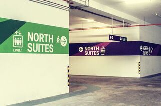
Does parking spaces have to be dark & ugly?
We share the same exact sentiment with Kevin of Guide Studios on this. Notwithstanding having a good wayfinding system, which is IMPERATIVE in an indoor car park, graphic treatments need to be bright, clear & welcoming at the same time. Why? Not least, to give visitors & those who frequent the parking area a sense of safety & security. Apart from signage & gateway environmental graphics treatments at the entrances & on the building, car park treatments provide people with the first impressions of the place they are at. Would you rather park at a dark, gloomy, dodgy looking car park or one that is well-signed, brightly lit & with great graphics? We at Fusion Werks will always always always, strongly recommend focusing 'feel good' graphic design to be invested on & applied to, car park areas. Read Article |


