
|
Golden Palm Tree Resort
Client:
Sepang GoldCoast Sdn Bhd |
|


|
BRIEF
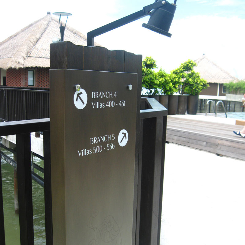
CHALLENGE Seaside location’s elements takes a toll on exposed signs. SOLUTION Wayfinding study & solution proposal of the project was straight-forward given the resort’s well-structured vehicular & pedestrian traffic flow with amenities & facilities located along the natural flow. |
SOLUTION (cont.)
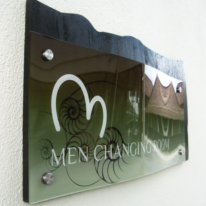
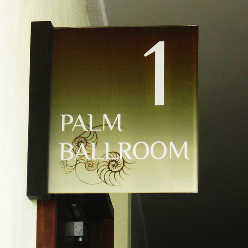
Design-wise, in the absence of brand guidelines, FW came up with solutions that complemented the architectural design of the resort, which had a very organic & natural feel to it. Shape & form as well as color palette of the signage family that were adopted, closely matched that of the resort’s architecture, while graphic elements were inspired by the sea’s eco-system. Along with international standard icons, customized icons were also developed to further enhance the exclusiveness of the resort, matching the typography design which emphasized on legibility & readability while maintaining an exclusive appeal. |
SOLUTION (cont.)
Natural wood was chosen as the main material for the family of signs, with Grade 316 stainless steel being preferred over Grade 304 for superior corrosion resistance. Acrylic panels with thicker depth were also used to prevent any instances of the panels warping, given the seaside heat. FW also recommended additional environmental graphic design (EGD) application solutions which included graphic treatment on glass elements & wind flags throughout the resort, to further enhance guests’ brand experience. |